new york issue 48
Apr 2006
Project M
New York - Creativity, Design
-

Client: Springer Publishing Company , Art Director: Mario Geissler, Project M , Producer: Nina Froriep, Clockwise Productions , Programer: Steve Ditmer
Client: Springer Publishing Company , Art Director: Mario Geissler, Project M , Producer: Nina Froriep, Clockwise Productions , Programer: Steve Ditmer ... see more
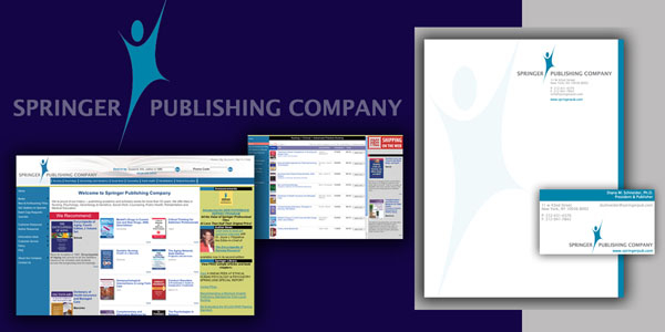
Creating a new logo was the first step for Project M in giving Springer Publishing Company a ‘facelift’. Derived from the founder’s last name (‘Springer’ is German and it means ‘jumper’), Project M created a new eye-catching icon that is contemporary and friendly, therefore making the company look more personal while reflecting their vision for the future.
Founded in 1950 by Bernhard Springer, SP established themselves as a leader in nursing and medical books, without ever giving any thought to Corporate Identity. After their acquisition by Mannheim Holding, LLC, management recognized the need to update the company's image and establish a presence on the Web.
The design of the web site (www.springerpub.com) is totally database-driven, making it extremely easy for the staff of SP to update and maintain their complete library of books and every element.